
 Ekaterina Skalatskaia

Rebranding can be one of the most powerful moves a company makes. Done right, it can refresh a brand, attract new audiences, and signal innovation. Done poorly, however, it can confuse customers, damage brand equity, and even lead to dramatic drops in sales.
Some of the most famous brands in the world—from Tropicana to Gap—have experienced high-profile rebranding failures. In many cases, the problem wasn’t just the new design itself, but the way the redesign affected packaging recognition, customer expectations, and brand identity.
For packaging and brand teams, these failures provide valuable lessons. Packaging is often the most visible expression of a brand, especially in industries like FMCG, beauty, and consumer goods. A poorly executed redesign can disrupt customer recognition on shelves, undermine brand trust, and create operational chaos during rollout.
In this article, we look at 10 of the most famous rebranding fails, what went wrong, and what packaging teams can learn from them.
Why Rebranding Often Goes Wrong
Rebranding failures rarely happen because companies lack resources or talent. Most large redesigns involve major agencies, extensive research, and significant budgets.
The real problem often comes down to a few recurring mistakes:
- Removing recognizable brand assets
- Making changes that are too radical
- Ignoring customer perception
- Failing to test designs properly
- Poor coordination during packaging rollout
Packaging teams are frequently at the center of these challenges. A redesign may look great in a presentation, but if customers can’t recognize the product on shelves, the impact can be immediate and costly.
Top 10 Rebranding Fails
Below are ten of the most discussed rebranding failures and what they reveal about branding and packaging strategy.
1. Tropicana Packaging Redesign (2009)
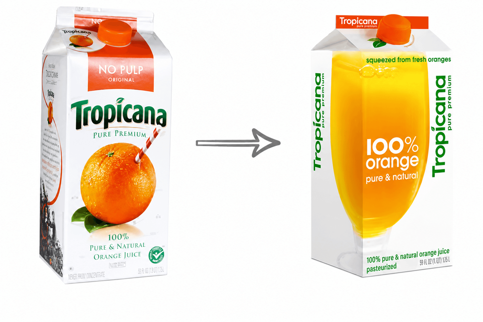 One of the most famous packaging redesign failures occurred when PepsiCo updated the packaging for Tropicana orange juice.
The redesign replaced the iconic orange with a straw image with a minimalist glass of juice and modern typography.
The problem? Consumers relied heavily on the recognizable orange image to identify the product on shelves. When it disappeared, many shoppers simply didn’t recognize the brand.
Within two months, Tropicana reportedly lost around $30 million in sales, and PepsiCo quickly reverted to the original packaging.
Lesson:
Iconic visual assets are critical for shelf recognition.
2. Gap Logo Redesign (2010)
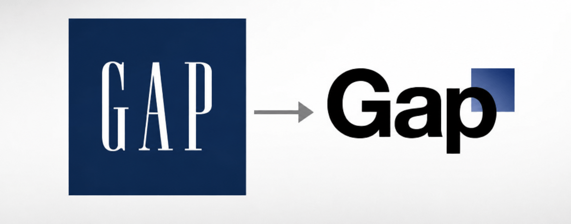 Gap attempted to modernize its brand with a new minimalist logo.
The reaction was immediate and overwhelmingly negative. Customers and designers criticized the design as generic and unnecessary.
Within six days, the company abandoned the new logo and returned to the original.
Lesson:
When a brand has strong heritage, radical changes can alienate loyal customers.
3. New Coke (1985)
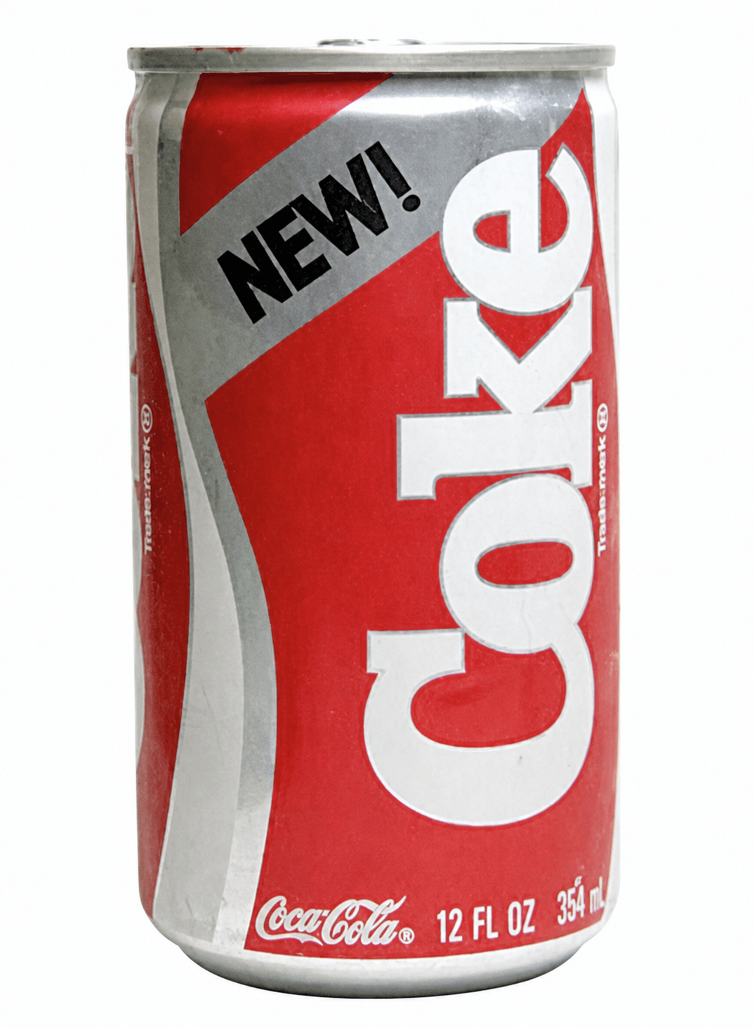
Although this example focuses more on product reformulation than visual identity, it remains one of the most famous branding failures in history.
Coca-Cola introduced New Coke, replacing its classic formula. Consumers reacted strongly against the change, forcing the company to bring back the original formula as Coca-Cola Classic.
Lesson:
Brands often underestimate the emotional attachment customers have to familiar products.
4. Uber Rebrand (2016)
 Uber replaced its simple black-and-white “U” logo with a complex visual system that varied across markets.
The redesign confused users and lacked a clear connection to the brand. Two years later, Uber abandoned the concept and returned to a simpler logo.
Lesson:
Simplicity and recognizability should always guide brand identity decisions.
5. Pepsi Logo Redesign (2008)
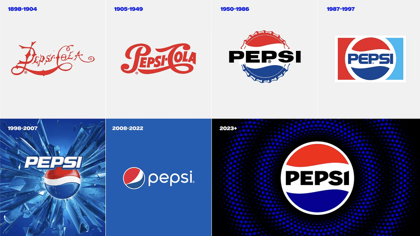 Pepsi introduced a new logo accompanied by an extremely complex branding document explaining its meaning.
The explanation—which referenced everything from the Mona Lisa to the golden ratio—became widely mocked online.
Lesson:
Brand design should communicate clearly without requiring lengthy explanations.
6. Yahoo Logo Redesign (2013)
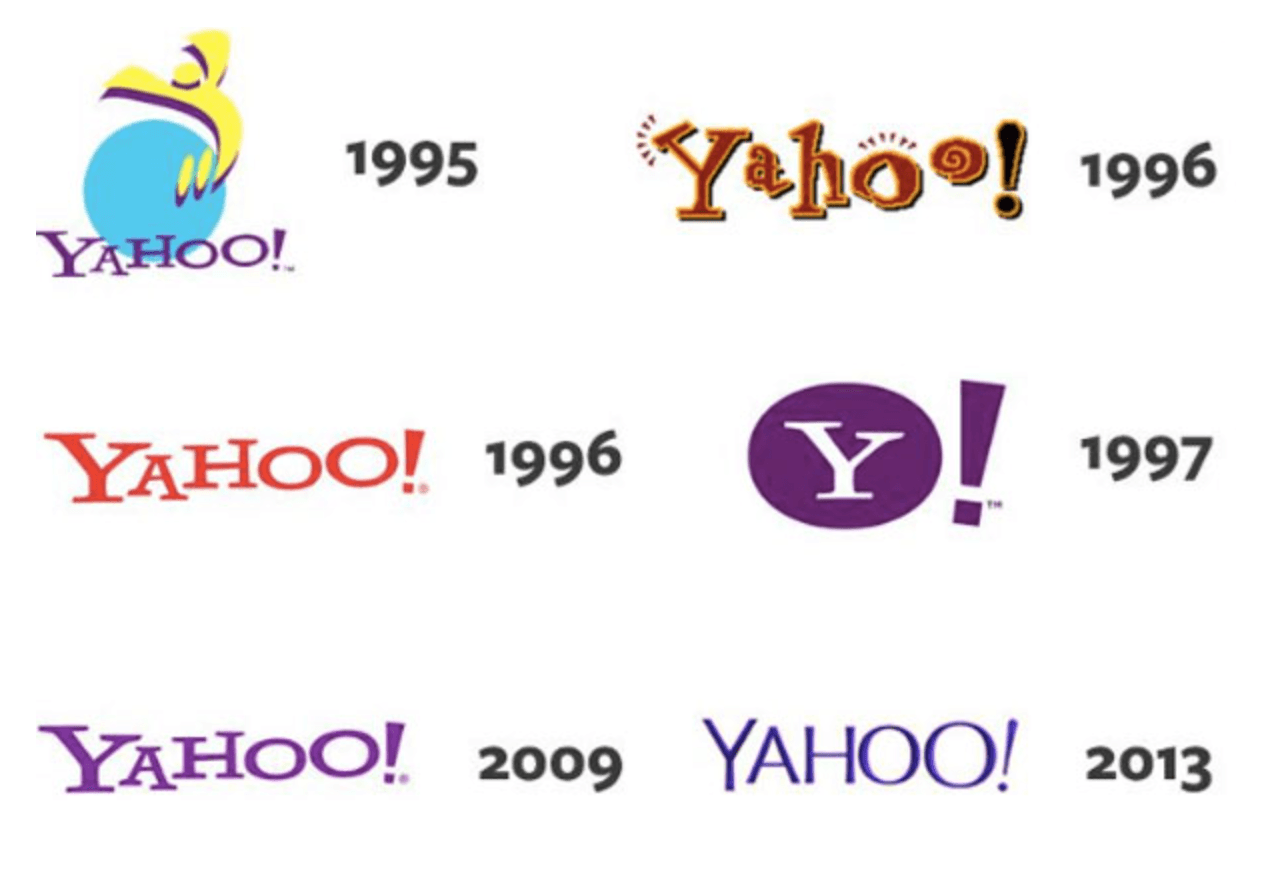 Yahoo launched a “30 Days of Change” campaign, revealing a new logo concept every day before selecting the final design.
While intended to generate excitement, the process appeared chaotic and lacked a clear strategic message.
Lesson:
Rebranding should feel purposeful and strategic, not experimental or random.
7. Airbnb Logo Launch (2014)
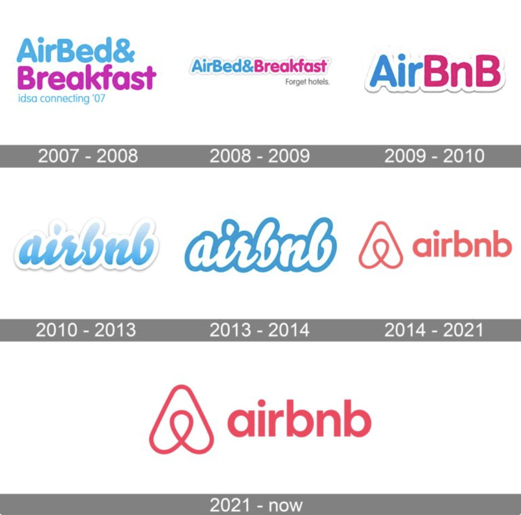
Airbnb introduced its new “Bélo” symbol as part of a major brand refresh.
However, the logo quickly became the subject of internet memes and controversial interpretations.
Despite the initial reaction, Airbnb ultimately maintained the logo and successfully integrated it into its branding.
Lesson:
Visual symbols should be tested carefully to avoid unintended interpretations.
8. RadioShack → “The Shack” (2009)
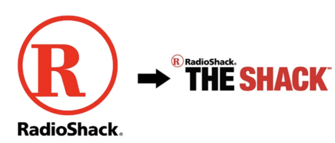 RadioShack attempted to reposition itself by shortening its name to The Shack.
The change confused customers and failed to solve the company’s deeper business challenges.
Lesson:
Renaming a brand without clear communication can weaken recognition.
9. Weight Watchers → WW (2018)
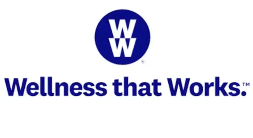 Weight Watchers rebranded as WW, promoting a broader focus on wellness rather than dieting.
However, many consumers struggled to understand what the new name represented.
Lesson:
Brand changes must be clear and meaningful to the audience.
10. J.C. Penney Rebrand (2012)
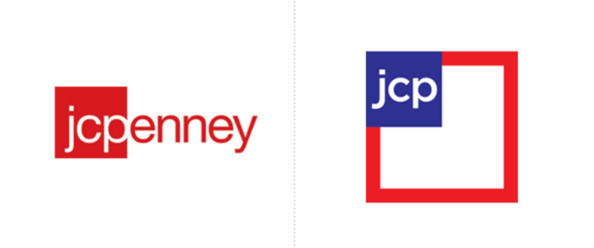
J.C. Penney attempted a dramatic repositioning that included a new brand identity and pricing strategy.
Customers were confused by the elimination of traditional discounts, and sales dropped significantly.
Lesson:
Rebranding must align with customer expectations and business strategy.
Lessons for Packaging Teams
While these failures involve different industries and brand elements, many of the lessons apply directly to packaging teams.
Below is a summary of the key takeaways.
| Rebranding Fail | What Went Wrong | Lesson for Packaging Teams |
|---|---|---|
| Tropicana | Removed iconic packaging elements | Preserve recognizable visual assets |
| Gap | Radically changed logo without need | Respect brand heritage |
| New Coke | Ignored consumer attachment | Understand emotional connections |
| Uber | Complex identity system | Prioritize clarity and simplicity |
| Pepsi | Overly conceptual design explanation | Design should be intuitive |
| Yahoo | Chaotic redesign process | Maintain strategic direction |
| Airbnb | Symbol open to misinterpretation | Test visual elements thoroughly |
| RadioShack | Confusing brand rename | Communicate brand changes clearly |
| Weight Watchers | Ambiguous new brand name | Ensure changes are understandable |
| J.C. Penney | Strategy disconnected from customers | Align branding with customer expectations |
The Hidden Challenge: Managing Packaging Redesigns
Beyond the creative challenges, rebranding also introduces significant operational complexity.
Packaging redesigns often involve:
- dozens or hundreds of SKUs
- multiple packaging formats
- regulatory requirements
- collaboration between designers, marketing teams, and external agencies
- regional variations and language versions
Without structured workflows, these processes can easily lead to:
- inconsistent designs
- version control problems
- delays in product launches
- costly production errors
For packaging teams, successful rebranding requires not only strong design thinking but also efficient artwork management and collaboration processes.
How Collabra Supports Complex Packaging Redesigns
Large packaging redesigns rarely fail because of the design itself. They fail in execution: hundreds of SKUs, several markets and languages, many stakeholders, and fixed launch dates. Collabra is a packaging agency in Gothenburg with more than 20 years of FMCG experience. It takes responsibility for that execution, from the first strategic decision to files ready for print.
Collabra supports redesign projects through:
- Packaging strategy: defining what should change, which SKUs to prioritize, and how the new design fits your brand architecture and portfolio
- Packaging design: creating the new design system and master designs, built to work across formats and categories
- Artwork adaptation at scale: rolling the master design out to every pack size, substrate, and language version with consistent quality
- Regulatory and market adaptation: handling country-specific claims, ingredient lists, and allergen information for each market
- Prepress and print-ready production: colour management, barcode checks, and technical file preparation to reduce reprint risk
- Rollout coordination: planning the redesign in waves and working directly with your printers and co-manufacturers so launches stay on schedule
During a rebrand or major redesign, this lets your team focus on decisions while one partner keeps consistency, speed, and quality across the whole portfolio.
Conclusion
Rebranding can refresh a brand and strengthen its market position, but it also carries real risk. Tropicana, Gap, Uber, and others show how quickly a redesign can fail when a brand loses customer recognition, clarity, or its heritage.
For packaging teams, the lesson is clear: a redesign has to balance creativity with continuity. Keep the visual assets customers recognize, make the brand message easy to read on shelf, and plan the rollout as carefully as the design itself.
Successful redesigns start with a clear packaging strategy, continue with design that respects what customers already know, and end with accurate execution across every SKU and market. Working with an experienced packaging agency like Collabra, which covers strategy, design, and production in one team, helps brands avoid the mistakes behind famous rebranding failures and launch packaging that truly strengthens the brand.
